The same questions,
every single day.
Admission season meant a queue of calls about fees, syllabus, timings and transport. The existing pages were out of date, difficult to update, and unreadable on a phone, which is how nearly every parent arrived.
The school also had no way to publish circulars or calendars themselves, so anything time-sensitive went out over messaging groups and was lost.
Structure first,
then design.
We sat with the office staff and listed every question they answer in a week, then built the site’s structure around those answers rather than around the school’s internal departments.
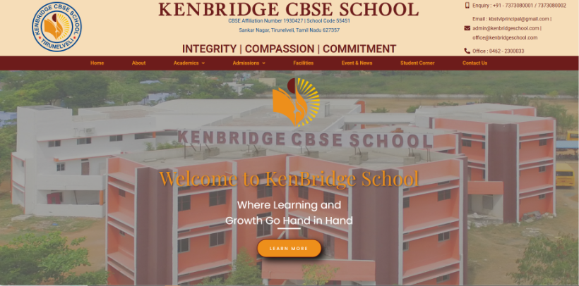
The visual language stayed close to the school’s existing identity, extended with a clear type hierarchy and photography guidelines so pages keep looking consistent as staff add to them.